
Street Burger
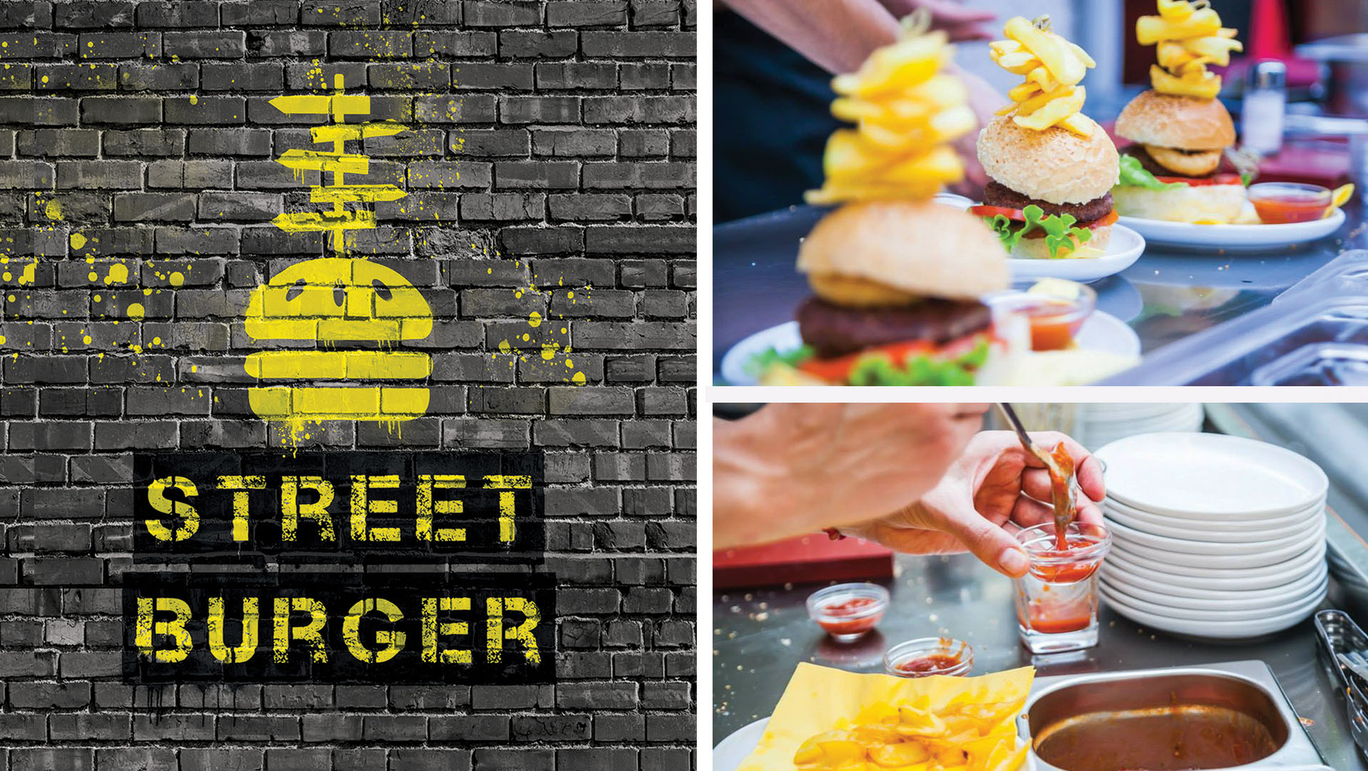
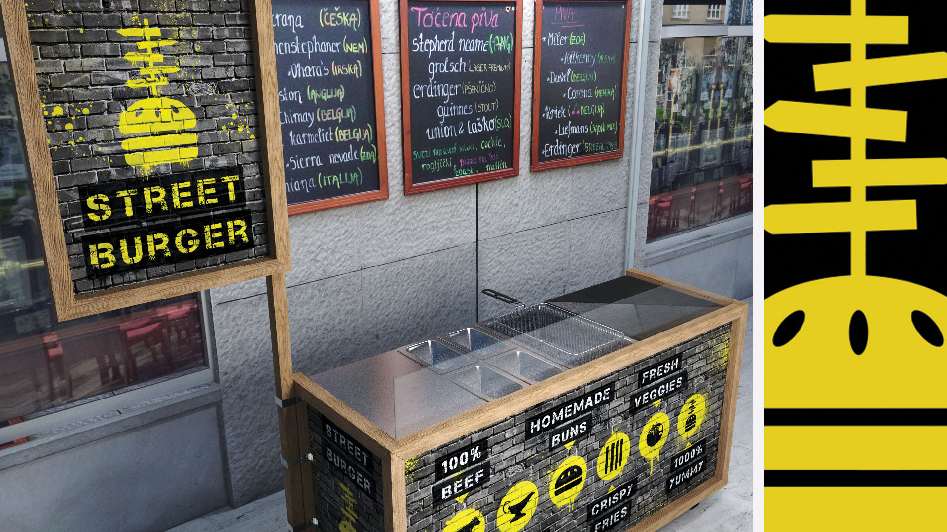
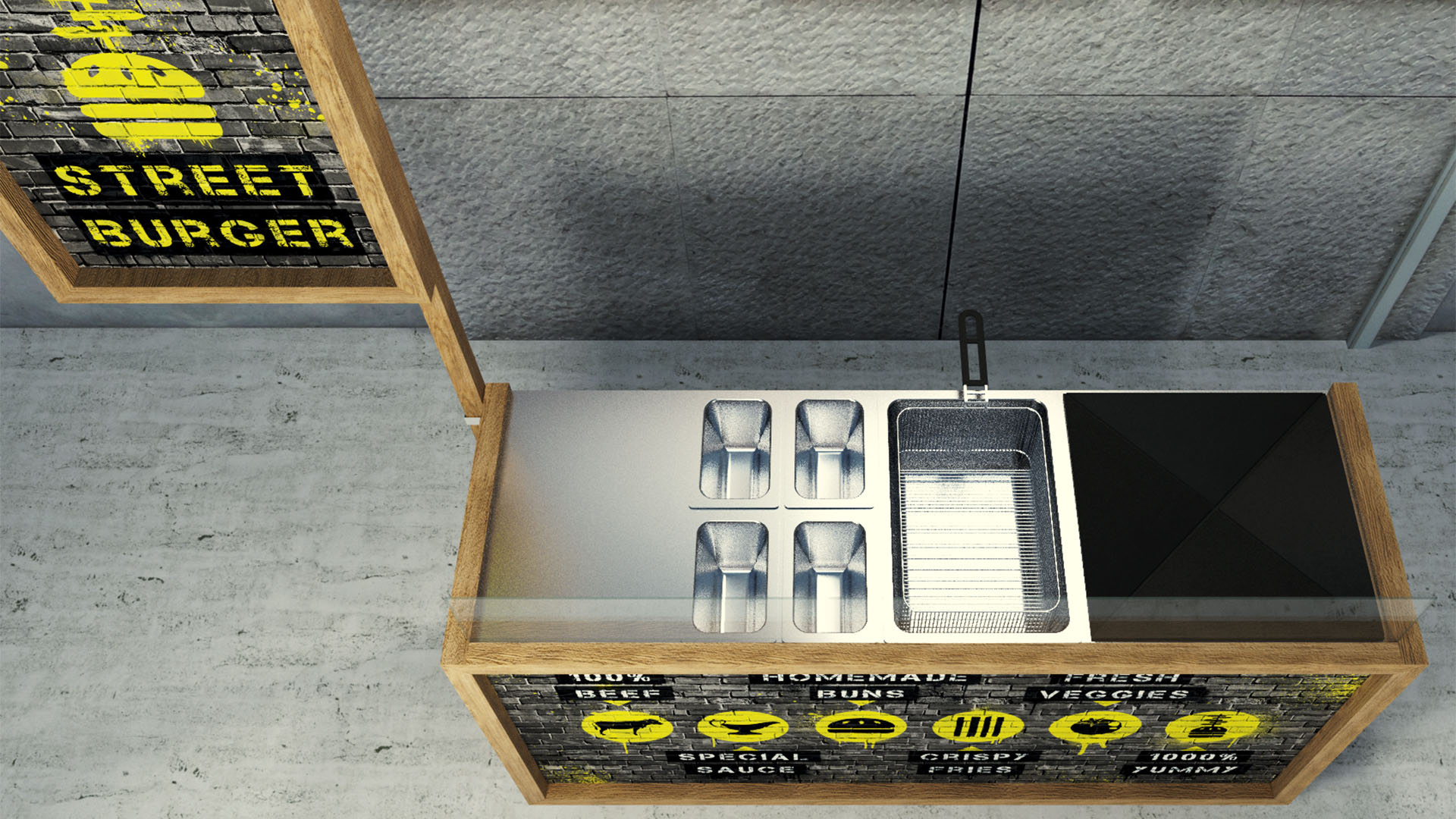
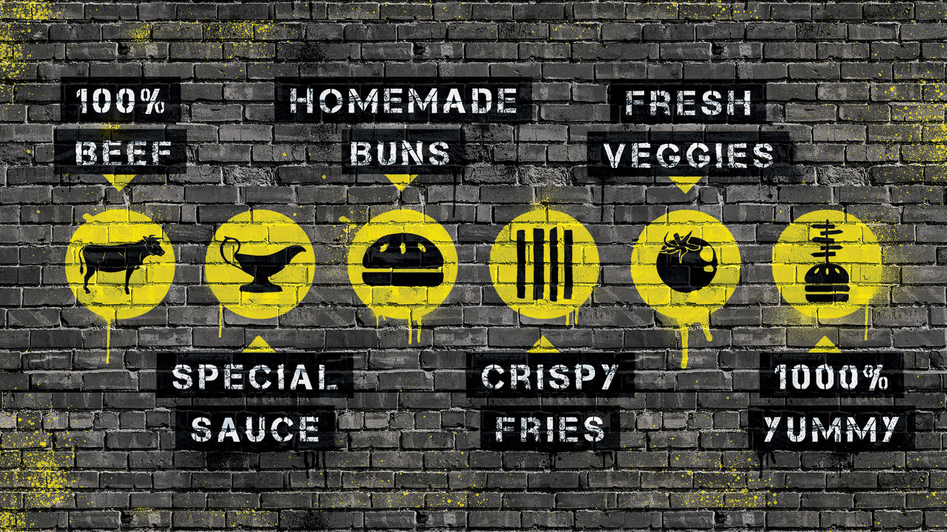
The client came to us with a clear vision of what their brand needs to portray and a name – Street Burger. Simple, but very literate. It’s a burger you buy on the street. The workstation is on wheels and all the equipment for baking is transportable, including the gas tank. Definitely not a new concept, but the client wanted his brand to have character and to portray the modern urban life of a young person who understands the concept of street food but wants it to be prepared using only best ingredients. First, we created the logo. Their burger is unique, because of the fries pinned into a bun with a wooden stick. The outline of that form reminded us of street signs and that is how the symbol for a Street Burger was created. The font for the textual part, as expected, is very street like. We used yellow as it is often connected to the street sign colour scheme. Contrasting its brightness is the heaviness of black. We tried to stay away from using pictures, but still managed to show the fine ingredients the burger is made of. We also built a workstation that is simple yet very recognisable. Check out the end result.