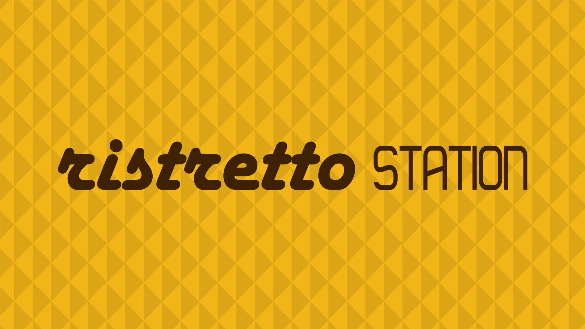
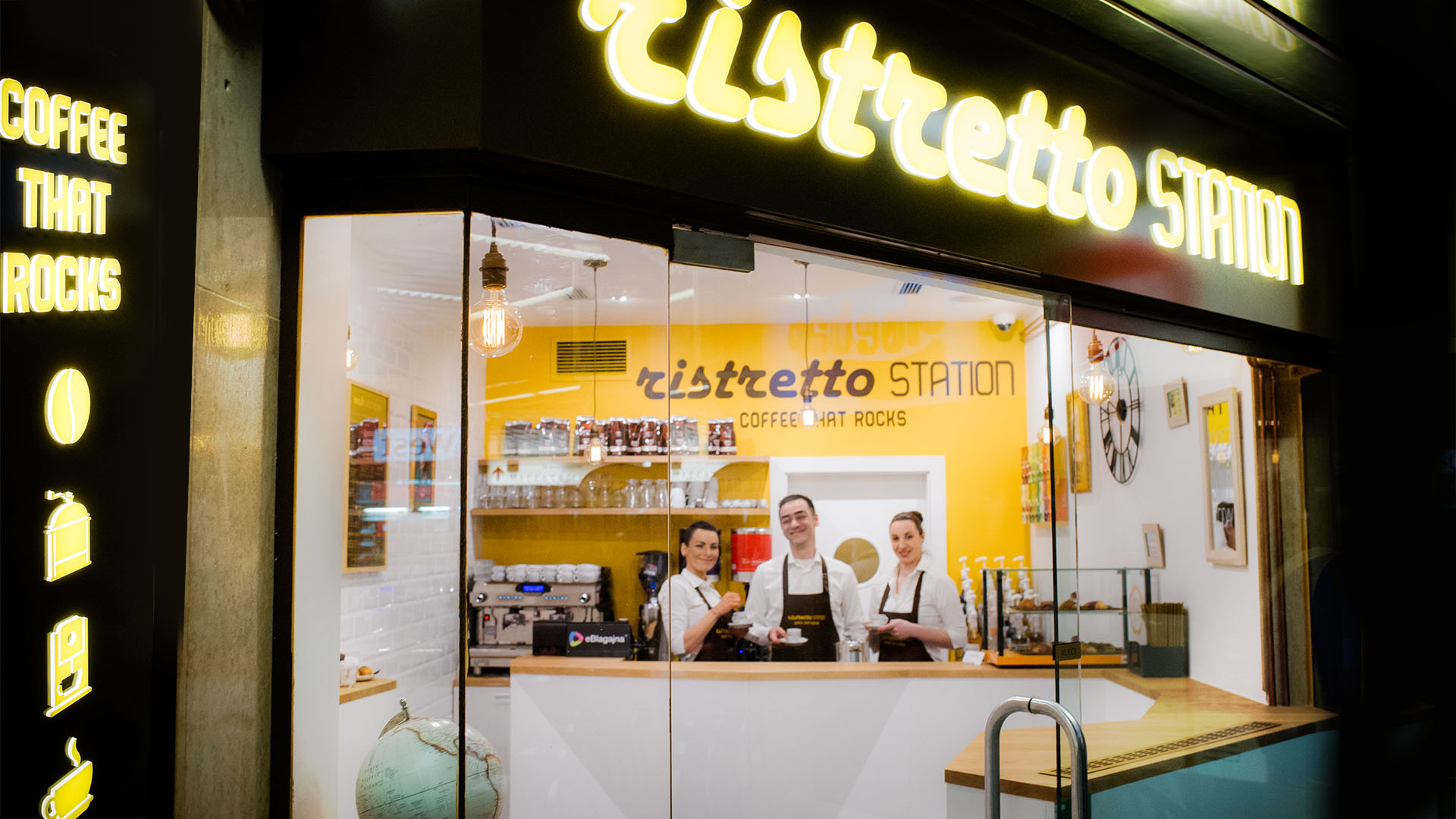


Ristretto station
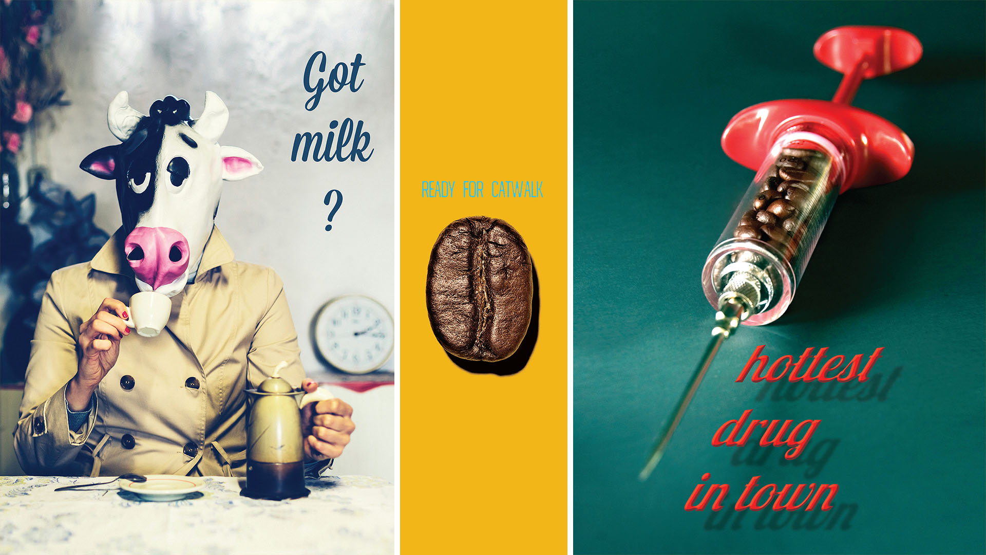
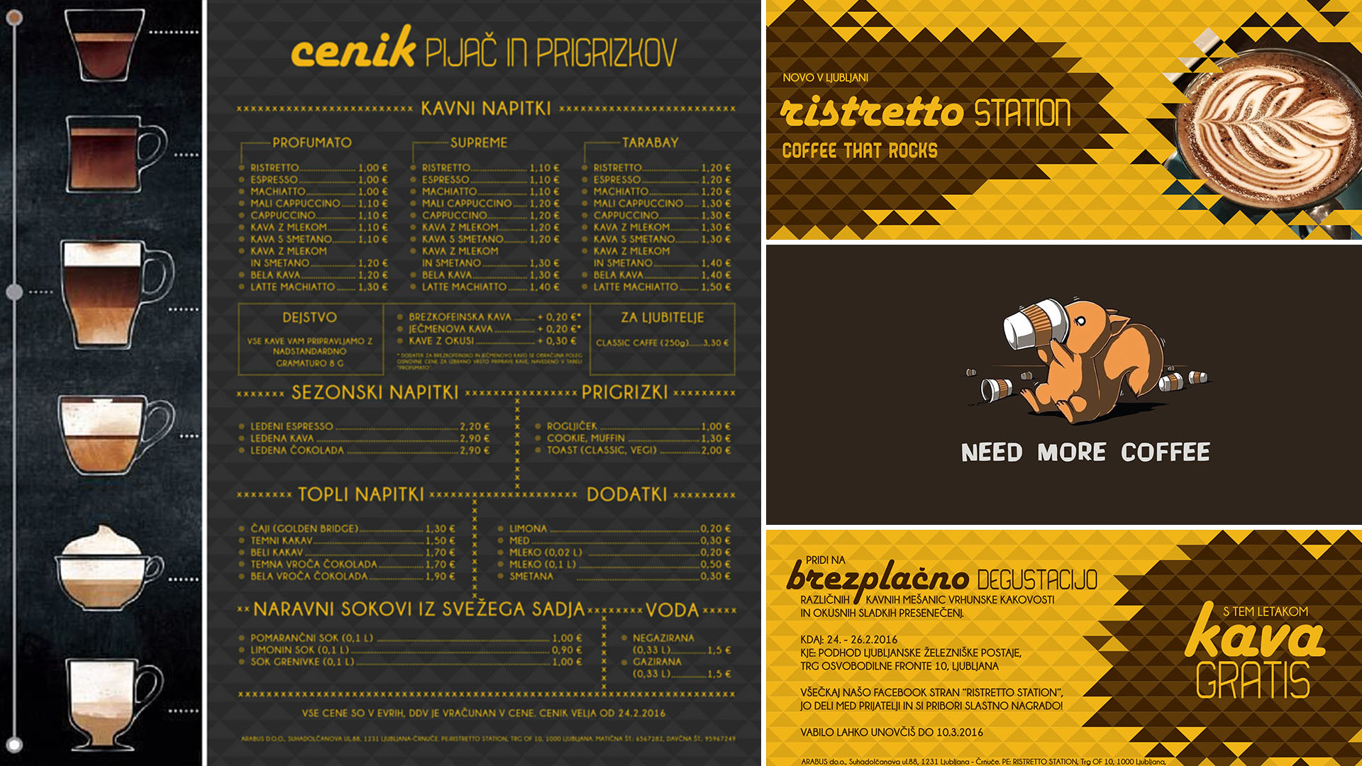
We were presented with a fun challenge to create a brand name, corporate identity and an interior design for a small coffee shop in the railway station underpass. The idea was to adopt an Italian way of drinking coffee in small counter standing coffee shops. You come to the cashier, order coffee and then drink it in less than 10 minutes, standing up next to one of the counters. Because of the fast way of drinking coffee, we came up with the name Ristretto station. Ristretto is the smallest dose of espresso, being half its size but just as strong. Main colour contrast for the logo and all other graphic designs, as well as the interior, is warm yellow and coffee brown. The first part of the logo is retro, the second one very minimal, which implies the merging of old tradition with the new way of drinking coffee. Slogan “coffee that rocks” gives you an impression it is something strong, short and cool. It also connects with the shape of the counters that imitate rocky mountains of Slovenia. We also created fun posters with play of words that entertain guests while they drink their coffee.