


Rainbow Design
A group of young market researchers scouted through the web, searching for a potential niche to sell ready-to-wear products. They realized that gay community is very loyal to a certain brand. They decided to create their own clothing brand and promote it exclusively to the gay community. They wanted the name to be easily recognisable and connected with the gay pride. And so … Rainbow designs was born.
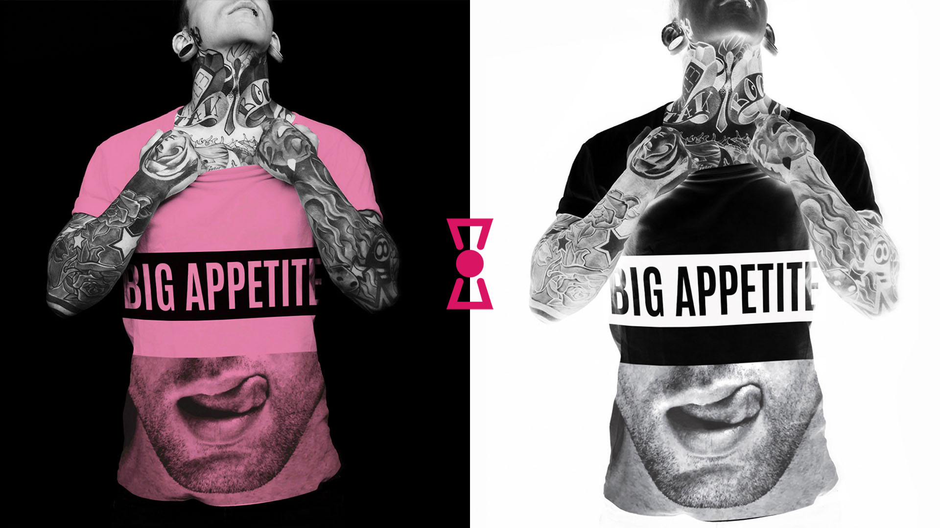
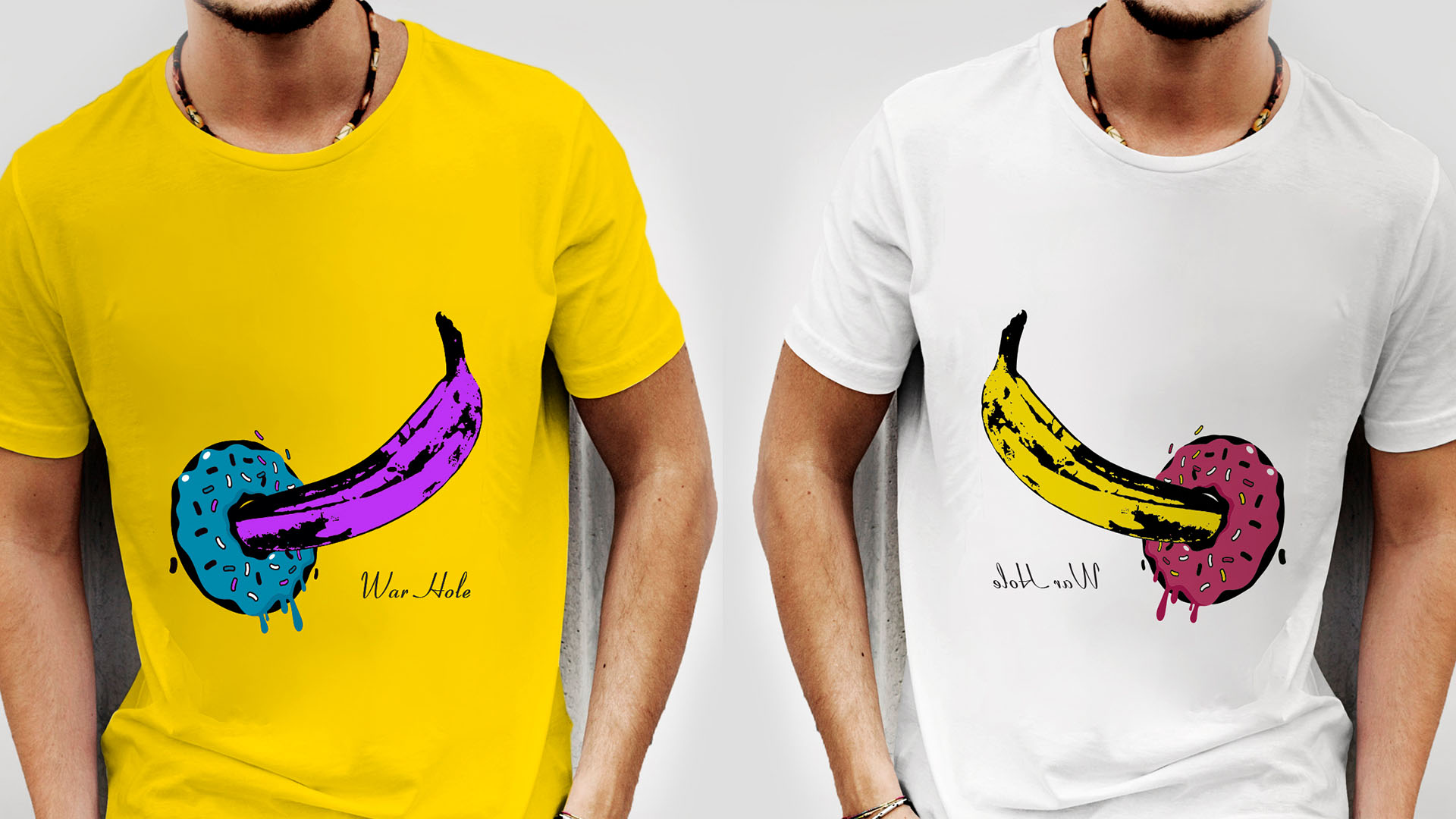
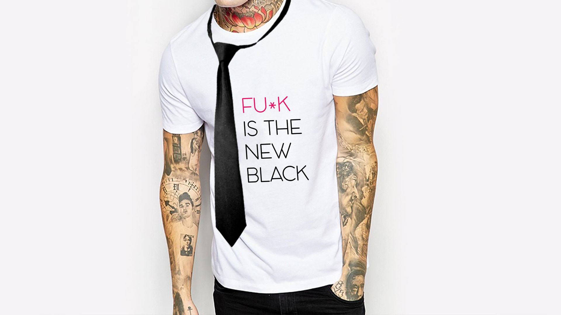
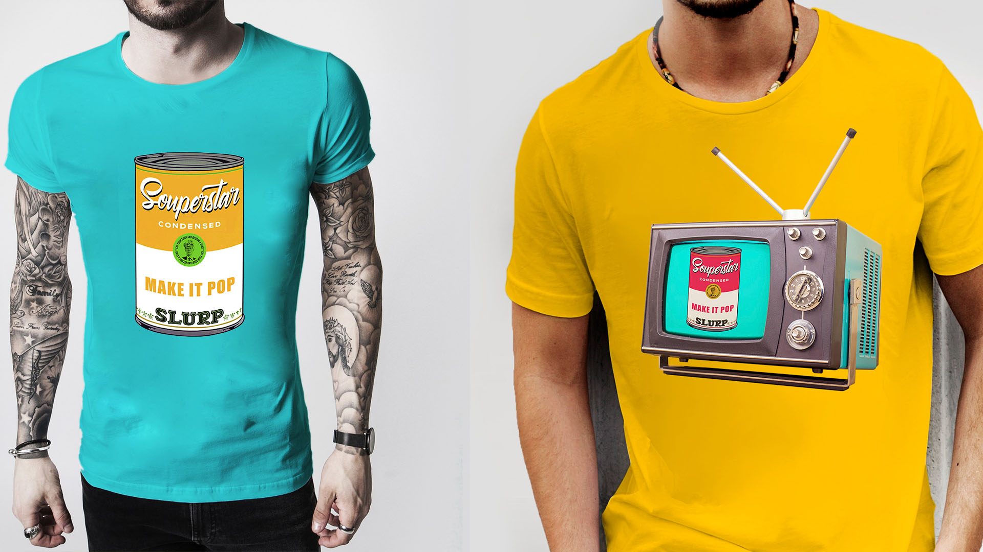
To roughen up the logo, we flipped the symbol of a bow used in the letter O upside down, in order to make it similar to a sign for toxic content. We wanted the logo to be sweet and intoxicating in one. Our next job was to create a series of prints that would be used on t-shirts, tank tops, caps, sweaters … They wanted the prints to be playful, provocative, simple and yet very easy on the eye. Check them out.