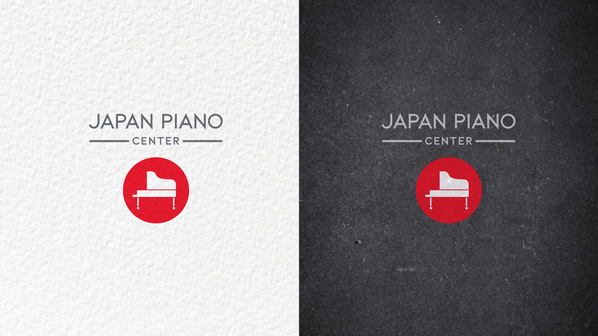
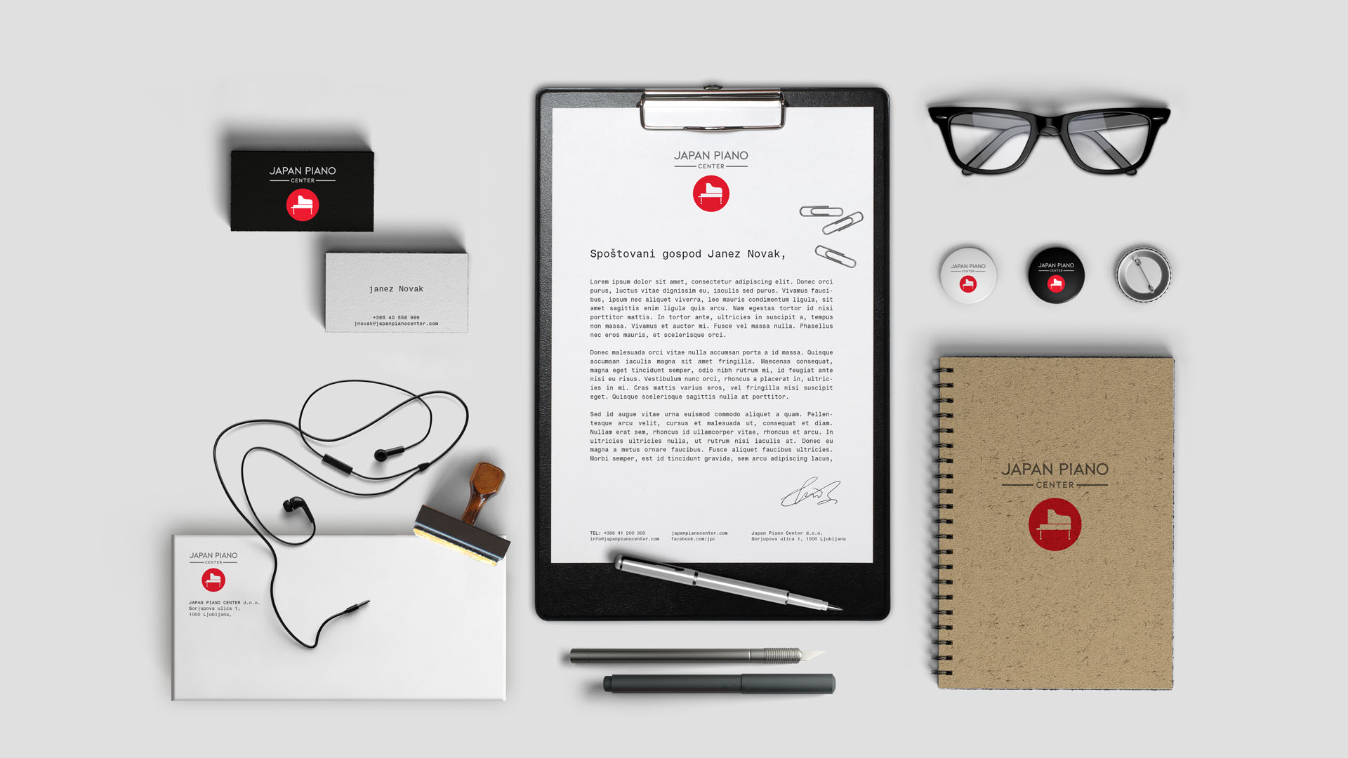
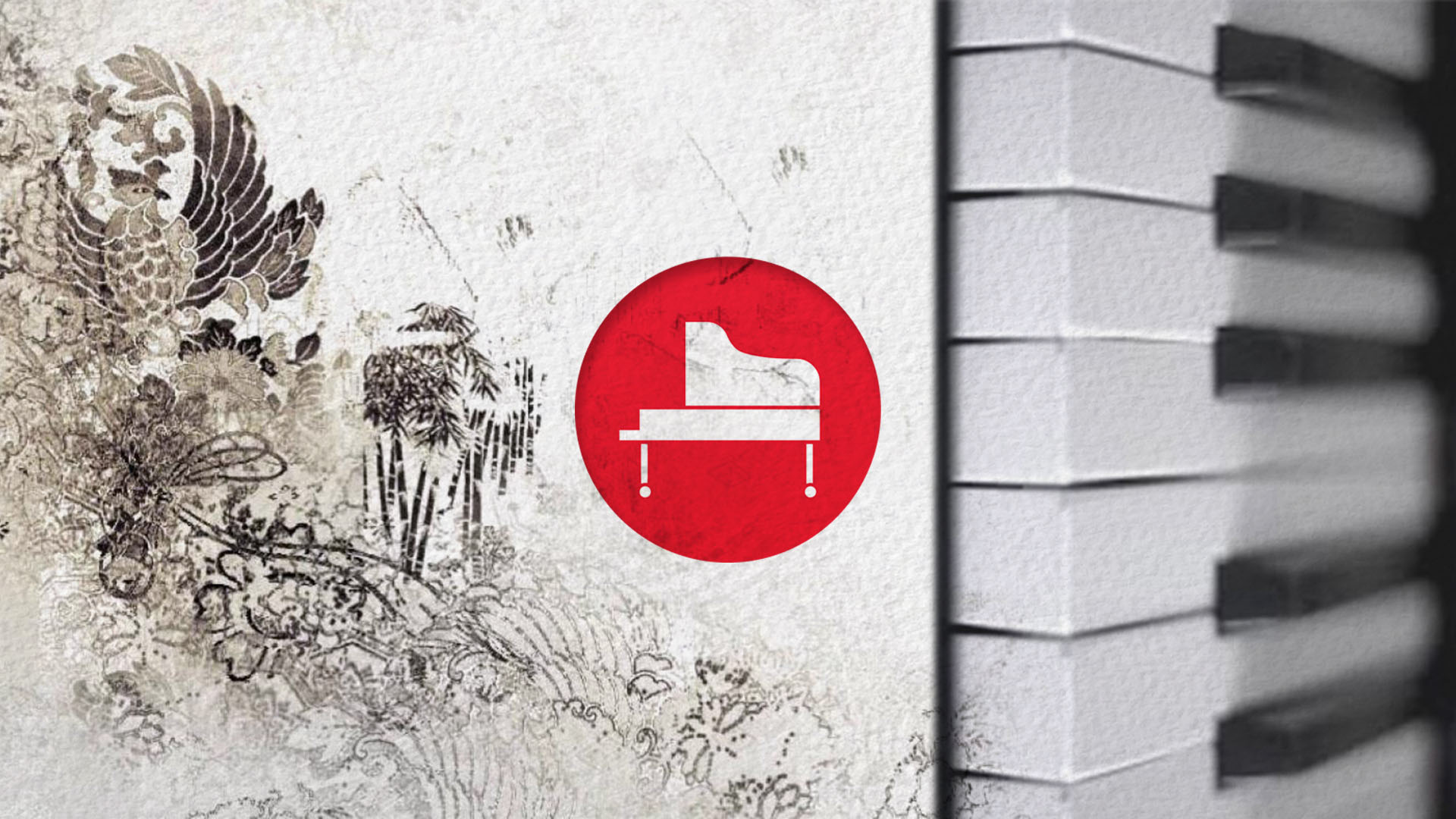
Japan Piano Center
The client wanted us to create a logo for a store that sells used Japanese pianos. They asked us to design a modern logo that combines recognisable Japanese symbols and simplicity of their design aesthetics. Simple red circle on a white surface imitates the Japanese flag and a modern font used for the textual part agrees with the country’s love for minimalism. We wanted to design a logo that is timeless in its modernistic approach. When creating the company’s corporate identity, we focused a lot on the details. We found it very important to portray the Japanese extreme attention to detail with which they create their music instruments