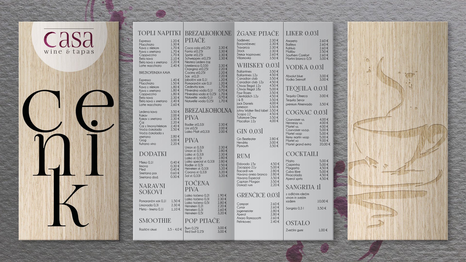
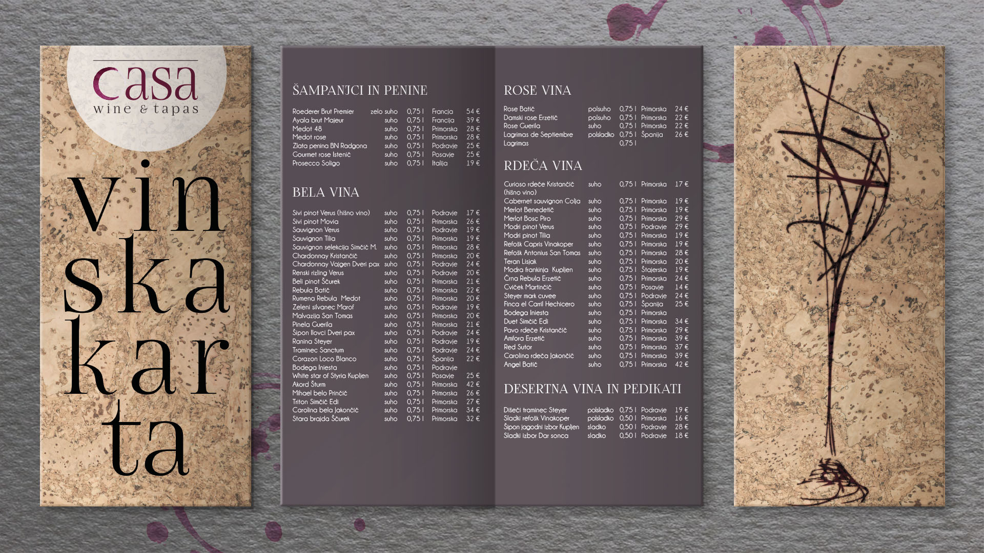
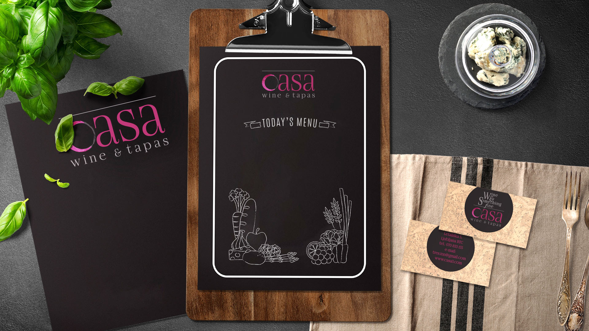
Casa Wine and Tapas
Our job was to create a corporate identity for a new wine and tapas lounge in the heart of Ljubljana’s biggest shopping district.
The owner wanted it to be prestigious and classic, but “fresh” at the same time.
Researching many traditional wine bottle lettering, we created a serif font that combines softness and elegance and still references the classic typography often used for many high end wine brands. We wanted to twist it up with the first letter being a bit different and also serving as the logo symbol. We created a wine stain that resembles the letter C.